Crafting exceptional software solutions exclusively designed for your business needs. Learn More
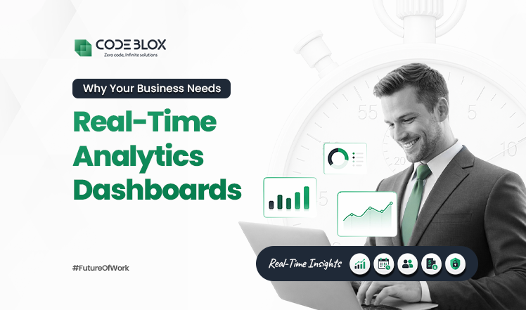
Why Your Business Needs Real-Time Analytics Dashboards

There is a very well-worn management phrase that describes the experience of running a business on weekly or monthly reports.
“You are driving at highway speed while looking exclusively in the rearview mirror.”
Put more simply, that means that every choice you make depends on an outdated form of reality and that the path forward is invisible. Businesses that function in this way are more likely to write post-mortems disguised as plans than to make strategic decisions.
Real-time analytics dashboards represent a fundamental departure from that model. Leaders have access to real-time operational data that reflects current events rather than having to wait for the finance staff to put last month's numbers into a static PDF.
It moves decision-making from guesswork informed by history to judgment supported by present-tense evidence. In markets where competitors are already operating with that kind of visibility, the speed at which a business converts data into action has become a sharper differentiator than product quality alone.
The Rise of Dashboard Analytics Software
Growing businesses usually carry an invisible structural problem. And because of that, their data lives in disconnected systems. What one can commonly see is the following:
- CRMs are being used for sales activities
- Other accounting platforms are used for keeping financial records
- Whereas the inventory numbers exist inside an ERP
Each of these systems shows partial information. And the only person who can assemble those fragments into something coherent is usually a data analyst.
But with dashboard analytics software, which serves as the organization's central nervous system, one doesn’t have to wait on an expert. You may ask, "Why?" That is because it pulls live data streams from all linked sources and presents them in a single interface, giving department heads a comprehensive picture without requiring them to submit a single spreadsheet request. The consequence is that data is no longer the exclusive territory of technical specialists.
In short, anyone, including a sales director, can track conversion rates by the hour. An operations manager can monitor fulfillment velocity in real time, or department heads, for that matter, can self-serve the insights.
Data becomes usable by the people who are closest to the decisions it should be driving.
Before investing in any visualization layer, though, it is worth understanding whether your current data flow is structured well enough to support it. Auditing your existing processes through a digital process builder can identify the gaps and redundancies that would otherwise surface as noise inside your new dashboard.

What Can Real-Time Analytics Dashboards Do to Improve Business Operations Better?
Let’s answer that simply! Real-time analytics dashboards help businesses reduce delays, improve visibility, and make faster decisions using accurate, continuously updated operational data.
Improve Operational Agility through Real-Time Business Analytics
In environments where conditions shift within hours, waiting for a next-day report creates direct revenue exposure. Real-time business analytics compresses the detection-to-response cycle from hours to minutes.
According to Fortune Business Insights, the global real-time analytics market is projected to grow from USD 1.09 billion in 2025 to USD 5.26 billion by 2032 at a CAGR of 25.1%. That simply reflects how widely organizations are treating live monitoring as a ‘core’ operational requirement.
- Latency elimination: A conversion rate drop on a mobile checkout page, detected via a real-time business analytics feed, can be traced to its root cause, whether a payment gateway error, a broken discount code, or a slow-loading asset, within minutes rather than the following business day. Each undetected hour in a mid-volume e-commerce environment is measurable revenue leakage.
- Early pattern recognition: Real-time analytics dashboards allow operations and product teams to identify gradual metric deterioration, such as a steady decline in repeat purchase rates or a creeping rise in cart abandonment. Moreover, these patterns can be detected weeks before the trend demands crisis-level intervention.
- Intraday course correction: Campaigns, pricing adjustments, and inventory reorder decisions that historically required a 24-hour data lag can be executed on the same day. Therefore, closing the window between a business event and a business response.
- Resource reallocation: When live dashboards show that one product category or service queue is underperforming, team leads can redirect capacity in real time.
More so, many companies now lean on no-code integration layers to connect these data streams without heavy backend development, making agility accessible to every department.
Gain Real-Time Control Over Your Financi al Decisions
A financial analytics dashboard gives you the detailed visibility that is required for proactive treasury and FP&A management.
64% of financial decisions are driven by data, according to a research, but the trust in that data still remains low. And, to address this, contemporary enterprise analytics systems offer the following:
- Daily Liquidity Tracking: Cash flow becomes a continuous pulse rather than a month-end surprise. Treasury teams can monitor positions against rolling forecasts to optimize vendor payments and short-term investments.
- Instant Budget Variance Alerts: If departmental spending exceeds its plan, the system flags the variance while the overage is still recoverable. This happens in real time instead of weeks after the money is spent.
- Fraud and Anomaly Detection: These systems automatically flag transaction patterns that deviate from norms, such as duplicate invoices, without waiting for a manual audit.
- Compliance-Ready Reporting: Using governed data through dashboard analytics software eliminates reconciliation errors that lead to significant annual losses.
Smartly Bridge the Gap Between Data and Execution
A dashboard that only helps you identify a problem without giving you a solution to that issue is just a static tool. You cannot, in any language, call it an operational asset. Moreover, real-time analytics dashboards lose their real value when organizations fail to connect insights to automated actions.The primary hurdle is alert fatigue. Without automated routing, a notification might sit in a queue until the opportunity to intervene has passed. Furthermore, there are systems that show you what is wrong, but they do not create a task for reporting the same to the responsible personnel. However, if using no-code workflow builders, you can easily connect to the automated reporting systems that your teams are already using to everyday apps like Slack or Jira. When a threshold is breached, for instance, a rule triggers a specific process. This ensures faster recovery from disruptions and fewer repeated operational bottlenecks.
How To Design Real-Time Analytics Dashboards For Faster Decisions?
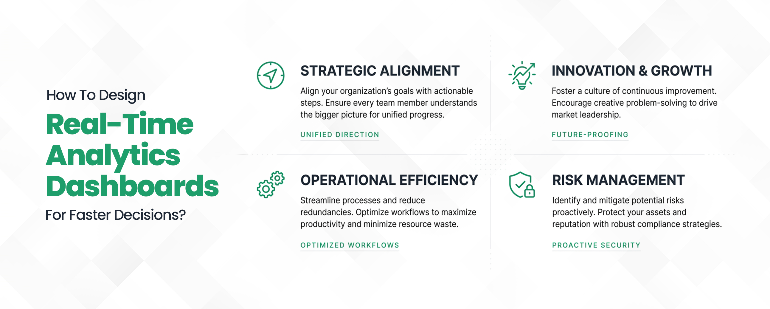
Dashboard adoption failure is almost always a design problem. Data visualization dashboards that surface too many metrics with equal visual weight, hide key figures behind navigation layers, or render poorly on mobile are abandoned within weeks of deployment, regardless of how clean or accurate the underlying data is.
Getting the design right is what determines whether a dashboard drives decisions or collects dust.
Information hierarchy
The starting point for any functional data visualization dashboard is strict metric prioritization. The primary indicators for each business function, the two or three numbers that tell a team whether they are on track, must be visible above the fold without scrolling, clicking, or filtering.
Everything else is secondary context. When leaders can read the dashboard's most critical signals in under thirty seconds, the interface earns regular use.
Cognitive load management
Building on that foundation, the next design imperative is knowing what to leave out. A dashboard displaying 60 KPIs simultaneously does not inform users; it overwhelms them to the point where no meaningful signal can be extracted.
Effective dashboard design groups related metrics together, suppresses secondary data behind drill-down layers, and uses visual cues like color coding and threshold indicators to direct attention where it is needed most.
Mobile-first architecture
Even the best-designed desktop dashboard has a structural blind spot if it was not built for mobile. Cloud-based analytics dashboards that are not optimized for tablet and smartphone access effectively exclude the most senior decision-makers from the tool's benefits.
Executives reviewing operational status between meetings are not sitting at a desktop. Cloud-based analytics dashboards must render accurately across device types without requiring a separate interface build.
Threshold-based alerting
Resenting just the passive alone is not sufficient when you are working with time-sensitive operations. You need a well-designed dashboard that can surface alerts the moment a defined threshold is crossed. This will simply remove the need for the platform users to actively monitor the interface. Moreover, it will ensure that critical signals reach the right person, regardless of whether they are looking at their screen or not.
Why Use a No-Code Platform to Build Real-Time Analytics Dashboards?
To build real-time analytics dashboards through traditional development usually means that you have to wait for a long time. You need an engineering team; backend setup takes time, and in many cases, it’s weeks or months before even the first usable metric shows up. For teams that need visibility now, that delay becomes a real problem.
This is where no-code platforms change the equation. Instead of depending on developers, business teams can set up cloud-based analytics dashboards on their own. Data sources can be connected, metrics can be defined, and alert thresholds can be set using a visual interface. The process is faster, and it reduces the load on already stretched IT teams.
There’s a reason this approach is being adopted across B2B operations:
- Speed of deployment: What takes months through custom development takes days on a no-code platform. This gives teams access to live business performance dashboards without waiting on an engineering queue.
- Cross-functional ownership: Finance, operations, and sales teams can build and update their own dashboard views directly using the no-code build. Thus, removing the dependency on a single developer whenever a report needs to be changed.
- Lower total cost: Enterprise analytics solutions built on no-code infrastructure cost significantly less to maintain over time than anything built from scratch.
- Easier iteration: When priorities of the business change, no-code dashboard analytics software lets teams add metrics, adjust thresholds, and reconfigure views on their own, without raising a development ticket.
This accessibility is precisely why no-code has become the default choice for teams that need dashboard analytics software to keep pace with operational change.
How to Choose the Right No-Code Platform for Real-Time Analytics?
Not all no-code platforms are designed to manage real-time analytics dashboards at scale. And if you make a wrong choice, it might just result in low adoption across different teams and disconnected data, as well as limited visibility. Thus, it is important for you to select a platform that offers you to build real-time business analytics without adding complexity. And that's the actual goal!
Keep the following things in mind when you weigh your alternatives:
- Native integrations with core systems
The platform should connect easily with your CRM, ERP, and financial tools. Disconnected systems break the value of business performance dashboards. - Scalability and performance
It should handle increasing data volume and users without slowing down or requiring frequent rebuilds. - Role-based access controls
Different teams should see only the data that’s relevant to them. This is critical for security and usability. - Mobile-optimized interface
Cloud-based analytics dashboards must work well on mobile devices to support decisions outside the office. - Built-in automated reporting systems
The platform should generate and distribute reports automatically without manual effort.
A no-code analytics dashboard platform that lacks these capabilities may work in the short term, but it will create operational gaps as the business grows.
Conclusion
The businesses that compete effectively in the next decade will not be the ones with the most data. They will be the ones who act on it fastest. Real-time analytics dashboards have moved from a competitive advantage to a baseline operational requirement, and the gap between organizations that have live visibility and those still relying on monthly reports is widening with every quarter.
From financial analytics dashboards that flag budget variance the moment it occurs to automated reporting systems that eliminate the manual overhead of weekly reporting cycles, the infrastructure for faster decision-making is accessible, deployable, and no longer limited to enterprises with large development budgets.
If your current reporting setup is still built around static exports and scheduled syncs, the cost of maintaining it is higher than you think. Explore what Custom Workflow Automation can do for your operations, or start by mapping your existing data flow with our digital process builder.
Take the next step toward real-time decision-making with Codeblox.
Frequently Asked Questions
Find answers to the most common questions about our no-code platform and how it can help you build powerful business application solutions without writing a single line of code.
No items found.


